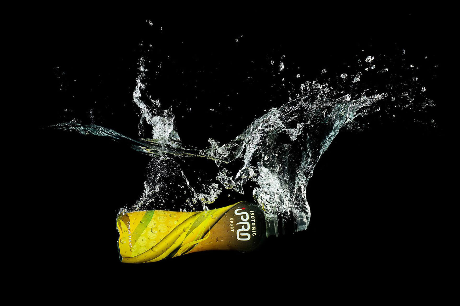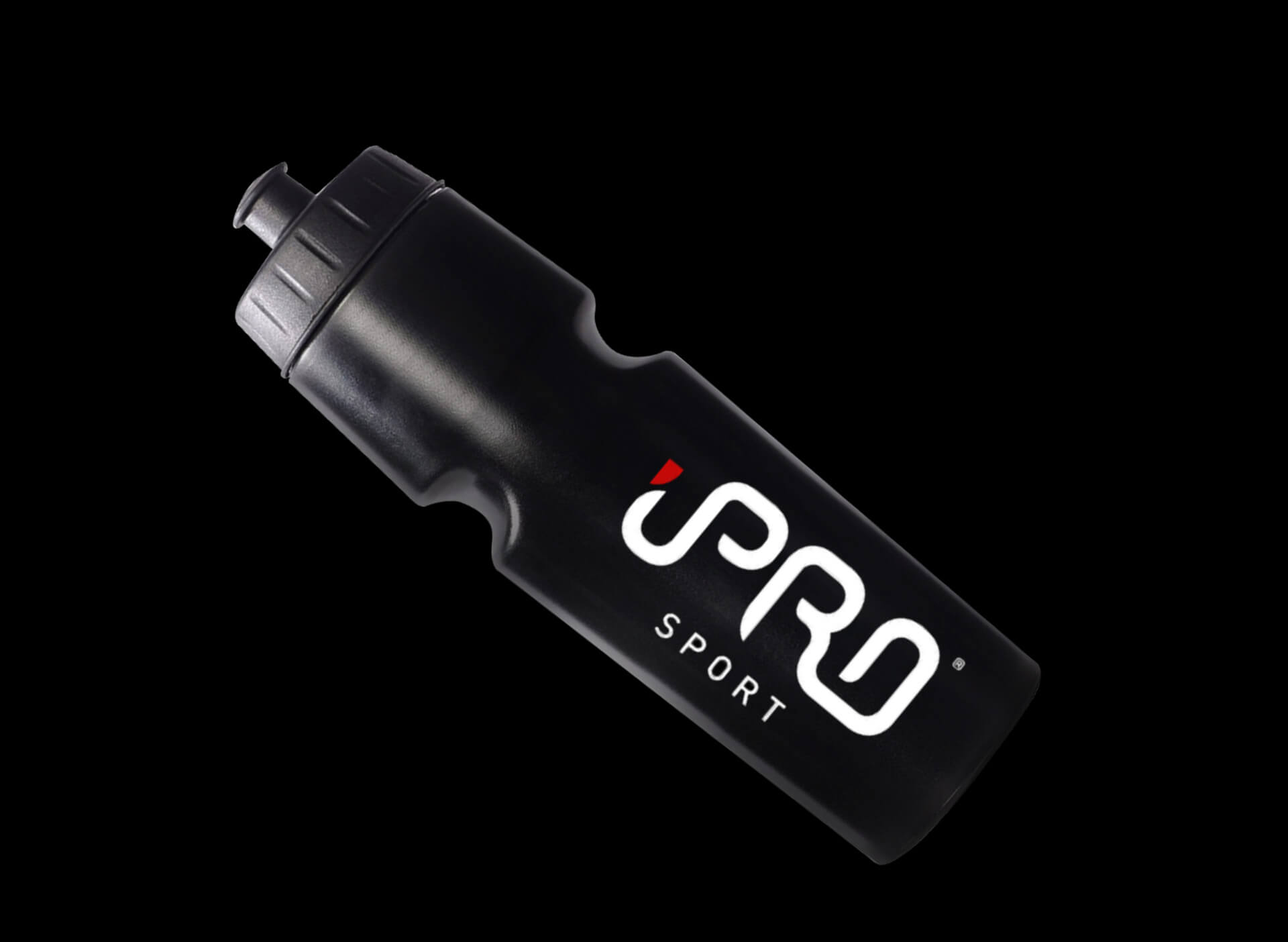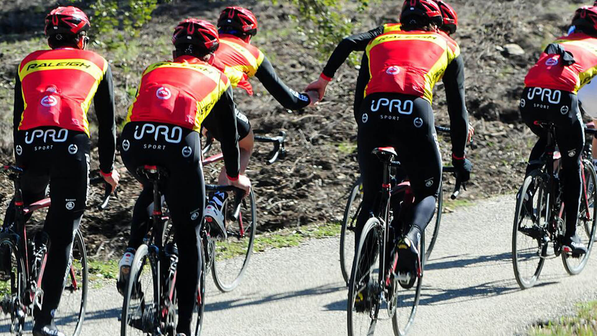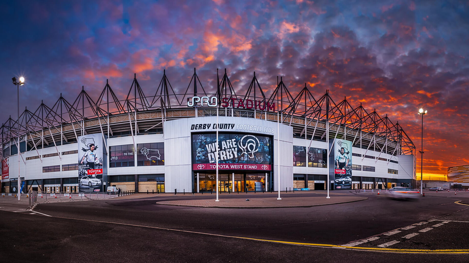

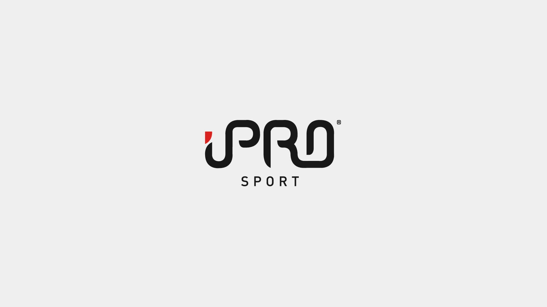
iPro stands for “Integrity” and “PROfessionalism”. iPro are fast becoming the leading supplier of Isotonic Sports Drinks to the world of sport. From professional athletes to grass-root clubs and universities, iPro Sport is THE name in isotonic hydration, not only in the United Kingdom, but across the globe in Cyprus, Australia, the Middle East.
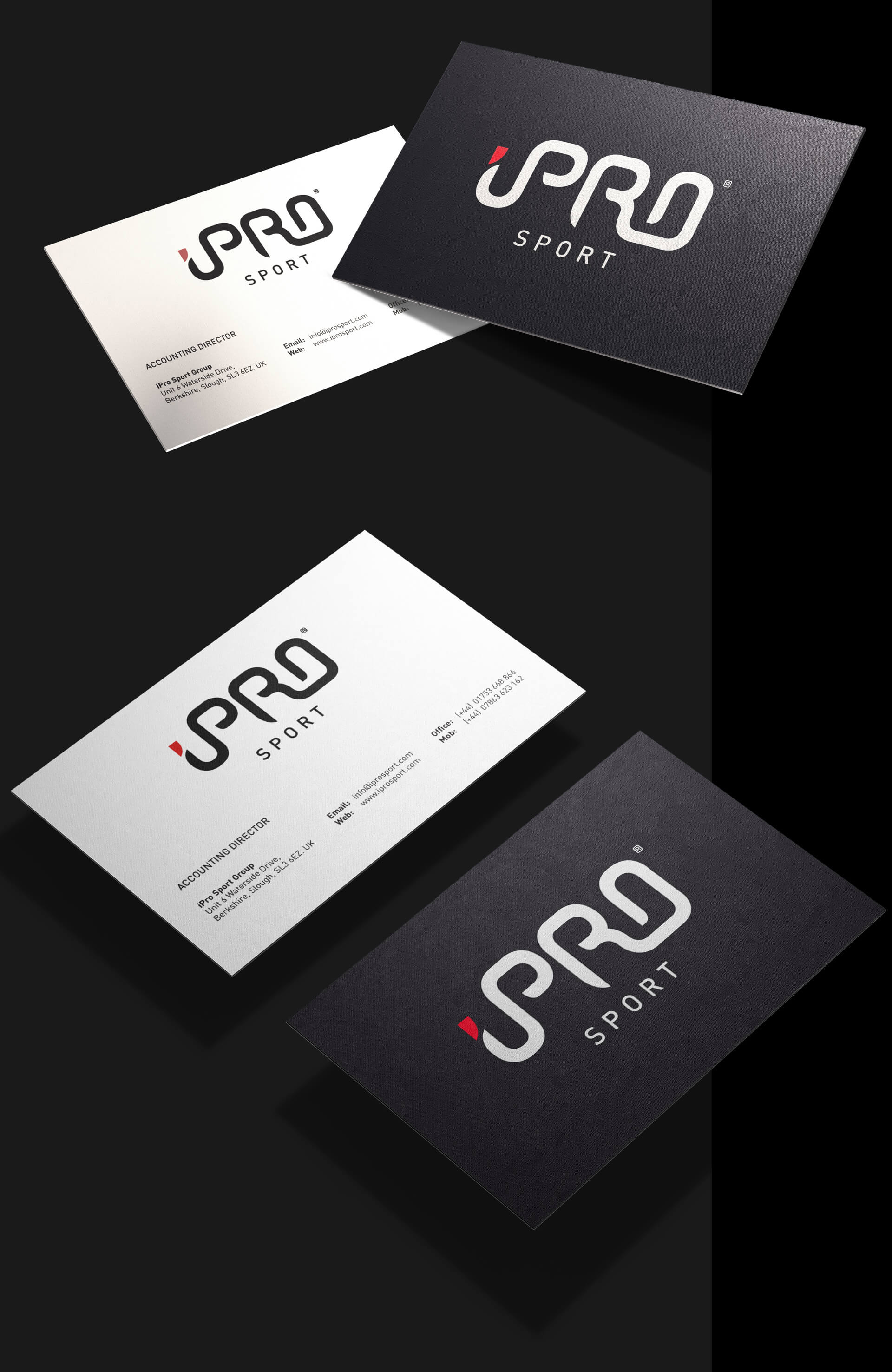
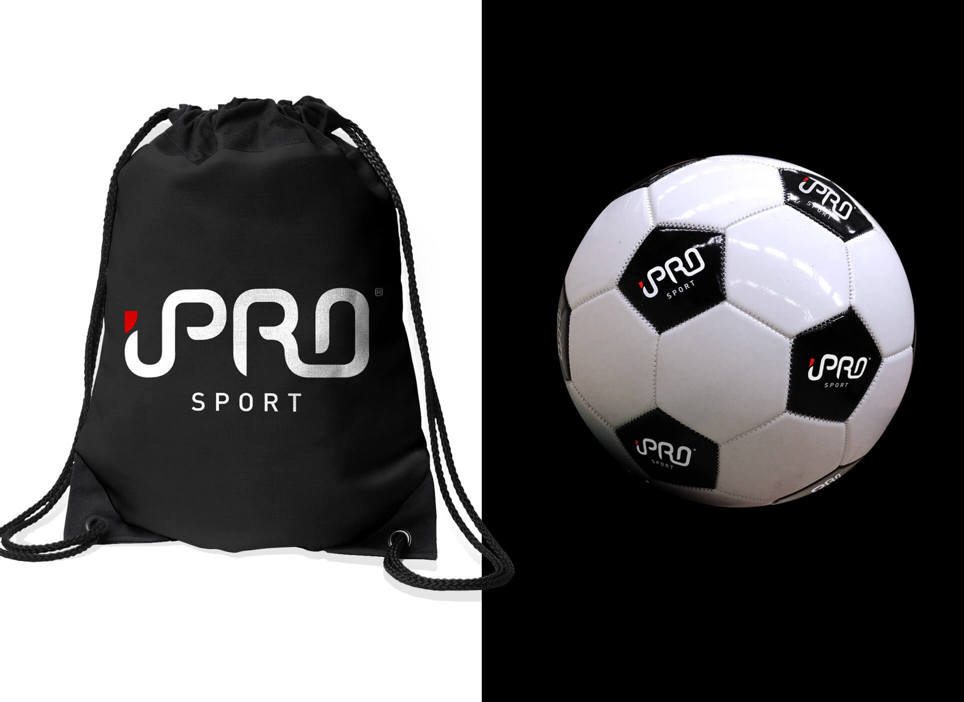
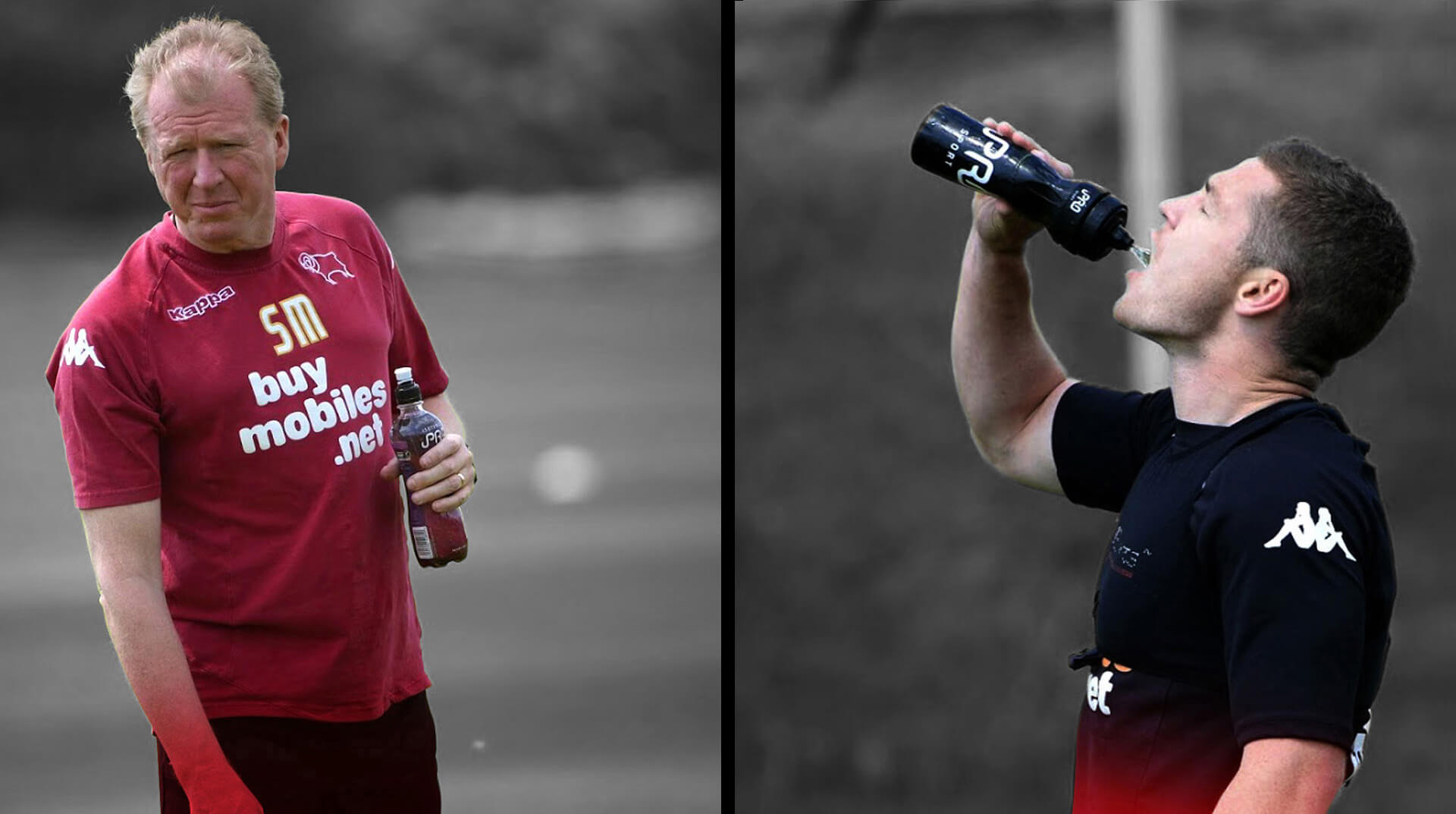
I created the iPro logo brand identity and brand strategy which included brand awareness and naming. iPro Sport is the official hydration partner to football teams across the Championship, League One and League Two, as well as teams within rugby, cricket, cycling and running associations.
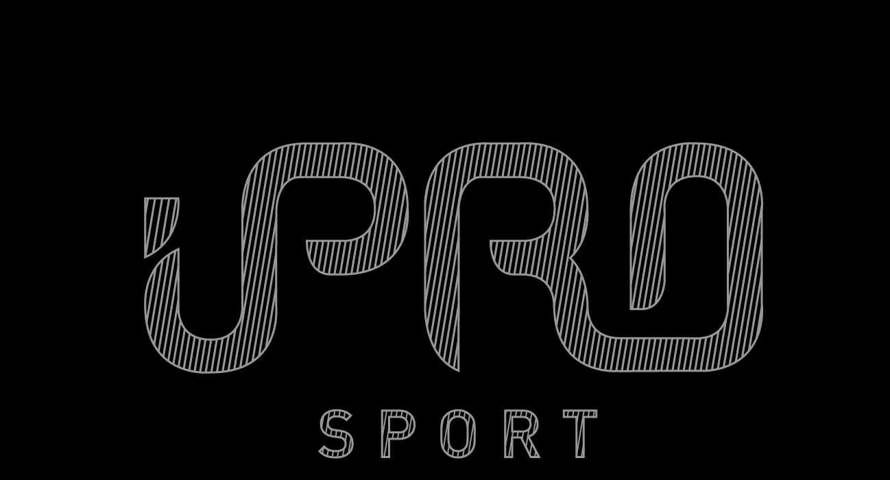
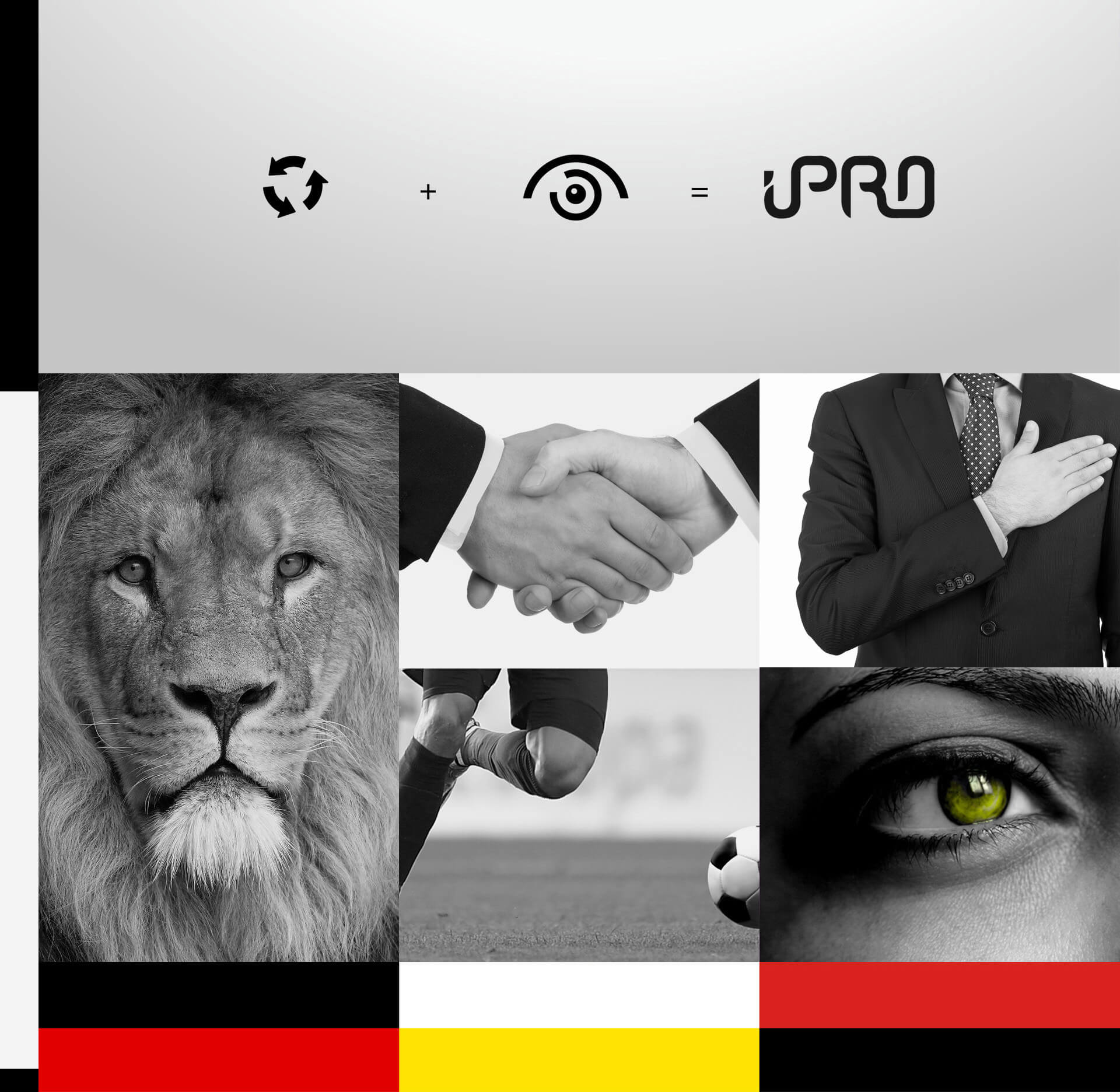
The name iPro stands for 'integrety' and Professionalism'. This formed the basis of research and concept ideas.

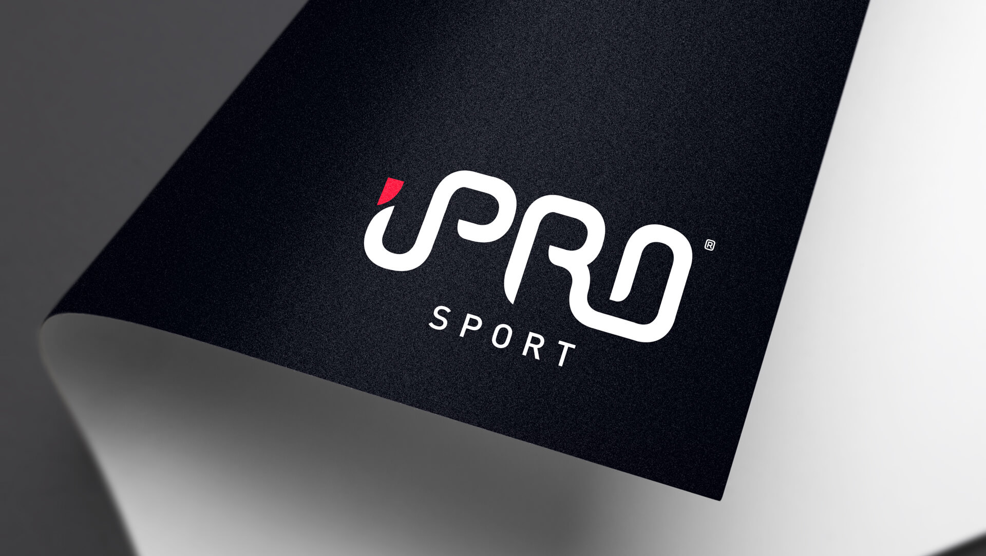
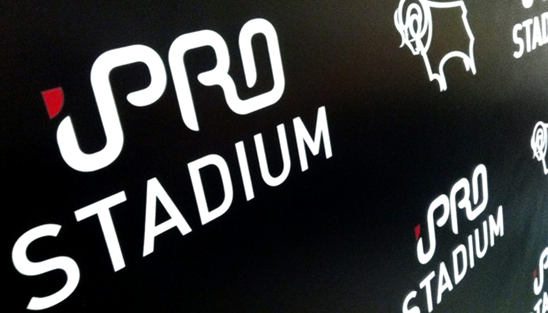
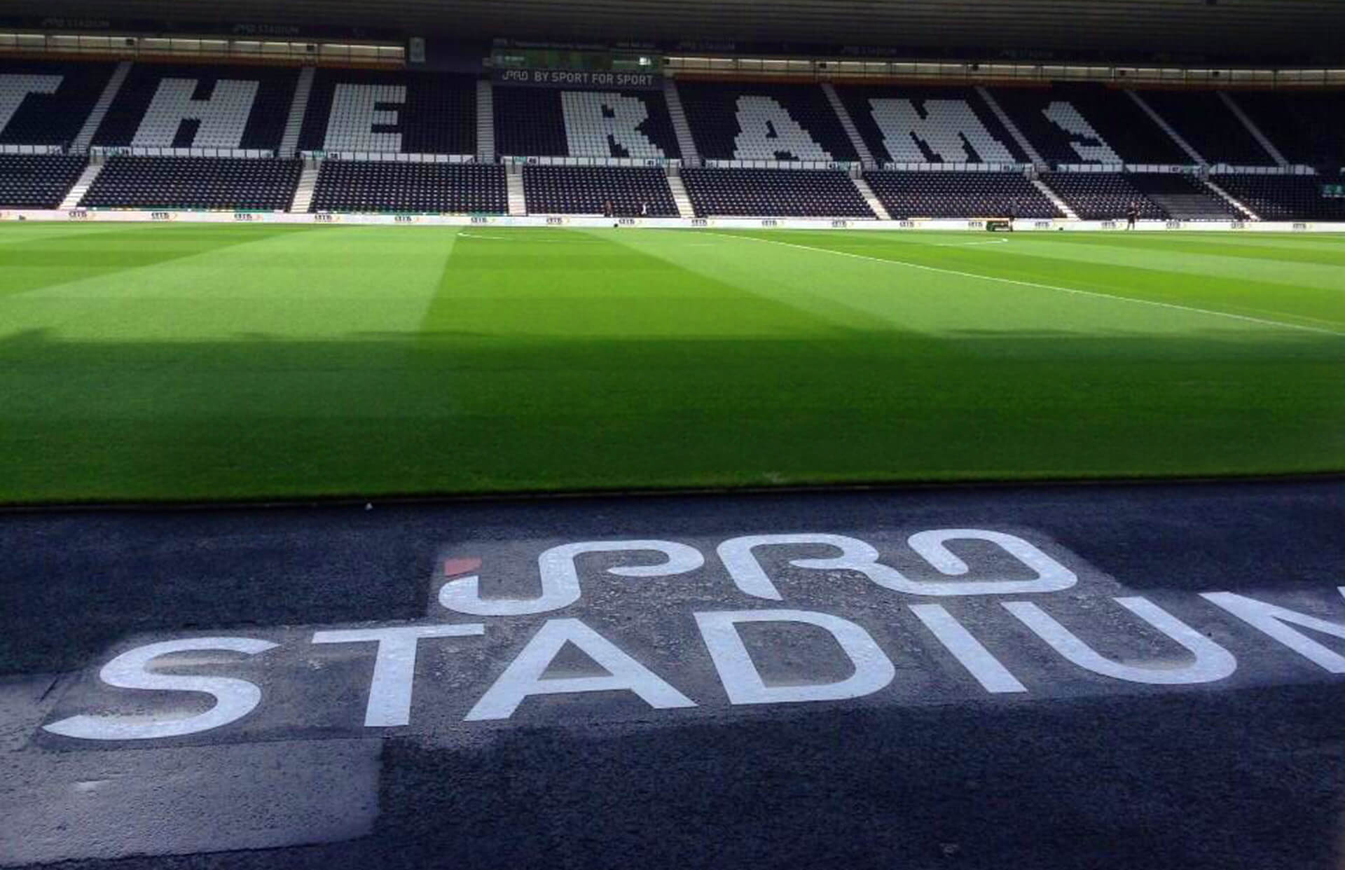
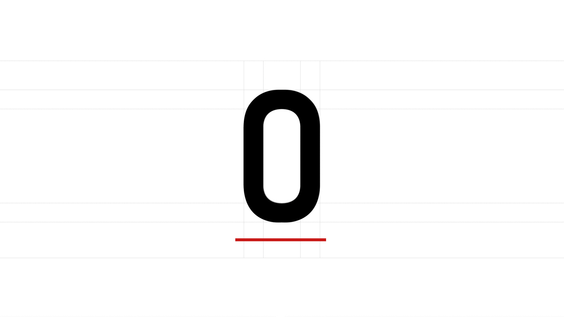
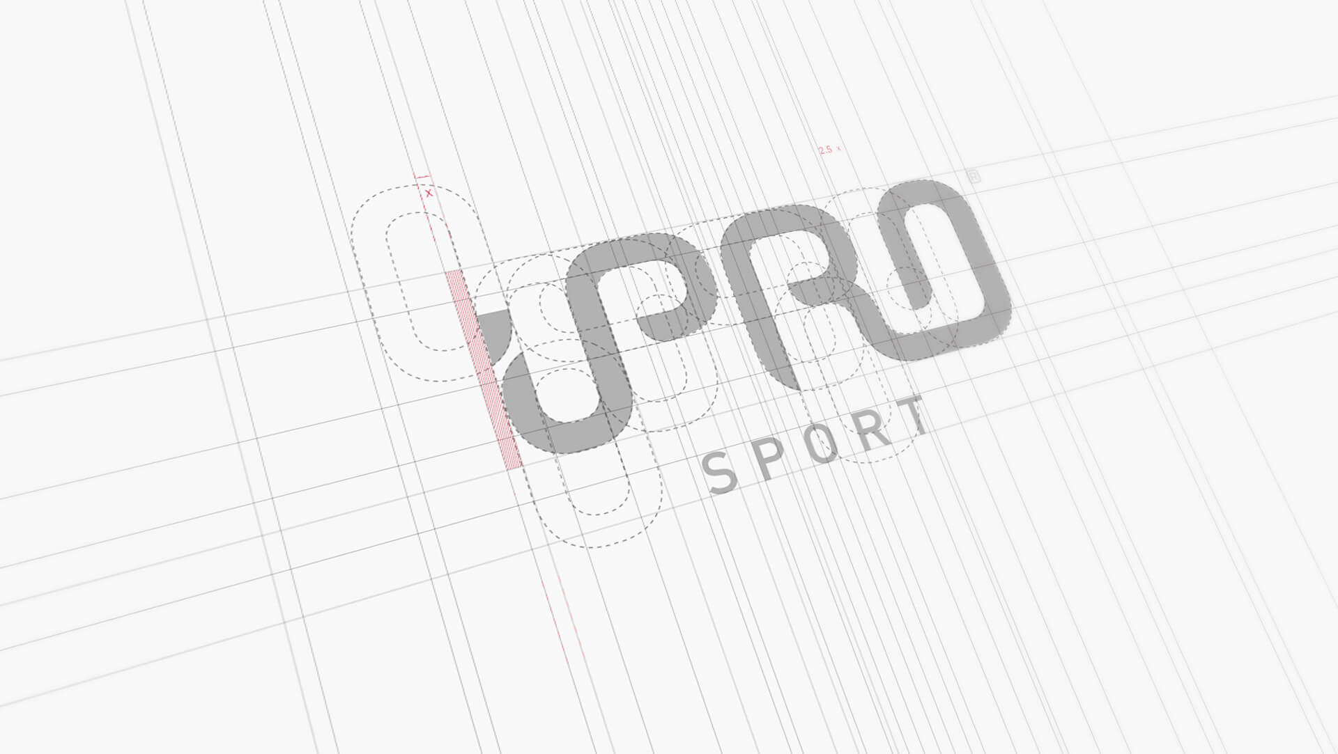
iPro Sport logo is based on the initial letter ‘O’. This circle shape represents a continuous energy flow of which iPro sport drinks provides it's consumer. This ‘O’ is the basis used to construct the logo.

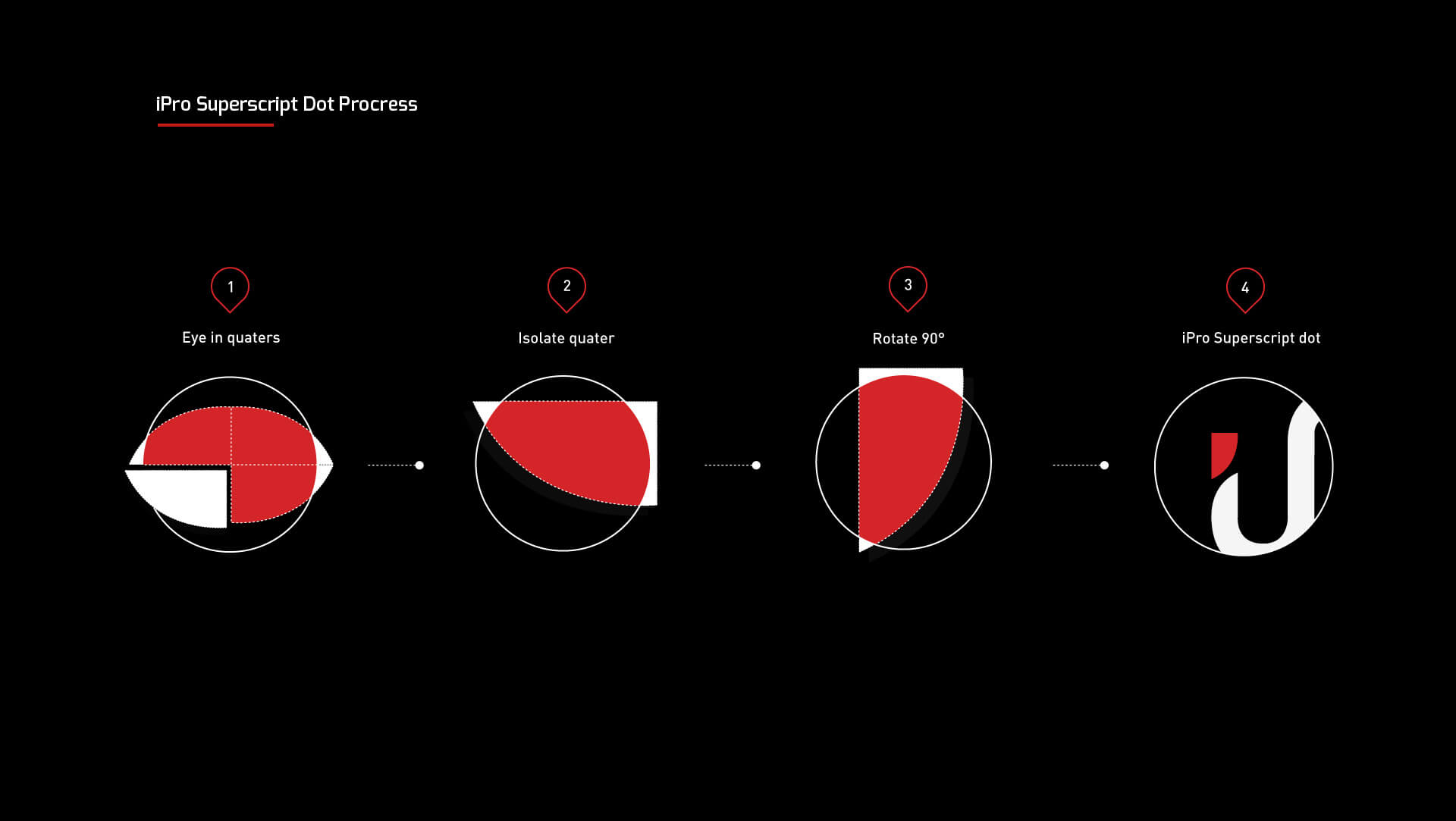
Here is an the construction diagram of the iPro logo.
Here is an animation of the letter ‘O’ which fits within the iPro logo perfectly.