Aics Group
Naming
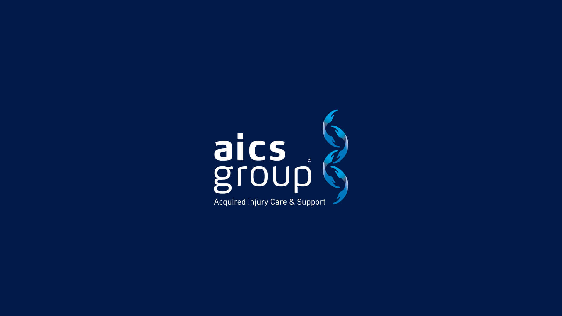
Logo
Visual Identity
Website
The company
The AICS Group is a Boutique Care Package Provider, specialising in the Care, Support and Rehabilitation of acquired injury and severe injury survivors.
AICS tailor make support packages for clients with acquired brain injury (ABI), traumatic brain injury (TBI), spinal cord injury and other disabling conditions, including cerebral palsy, multiple sclerosis and muscular dystrophy.
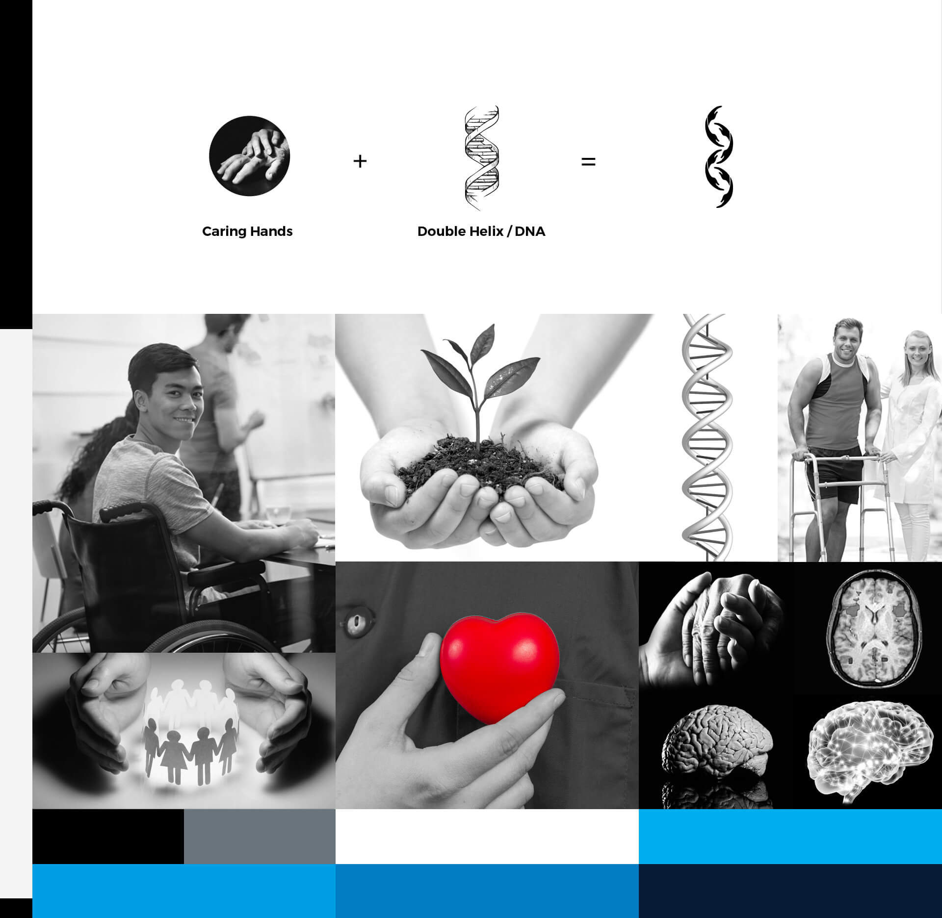
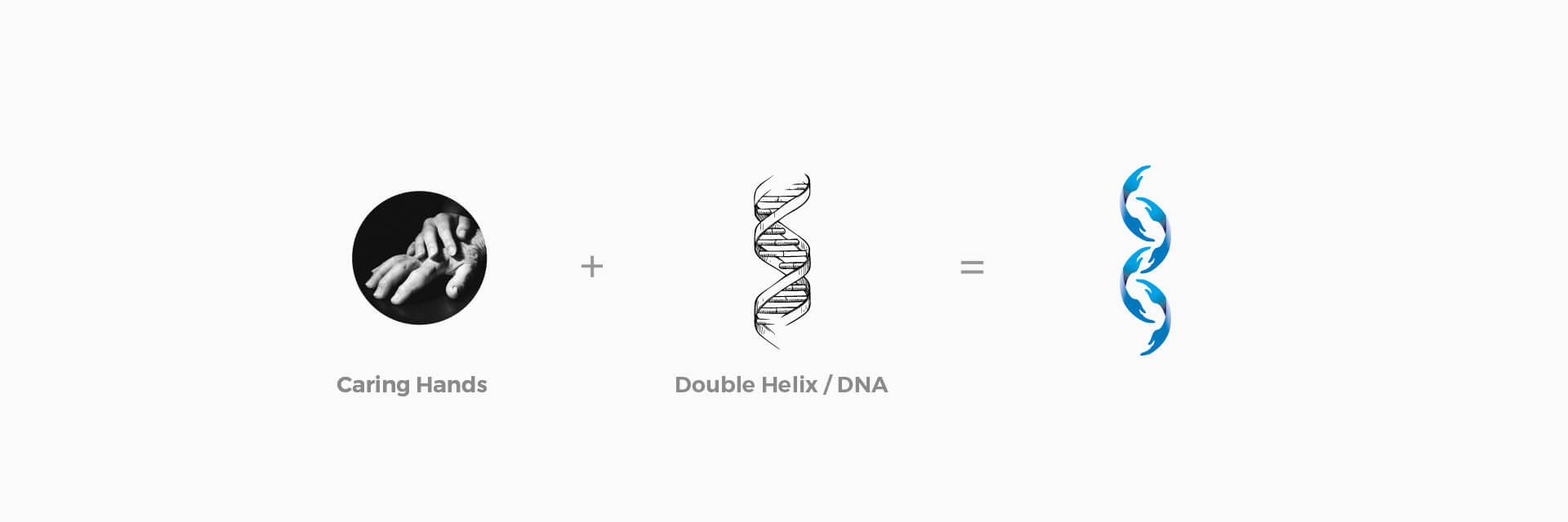
We are all a product of our DNA. The structure of DNA is made up of molecules in the form of double helix compounds found in the whole nervous system of the body. The service that AICS provide is care and support based relating to Injury of the brain and spine.
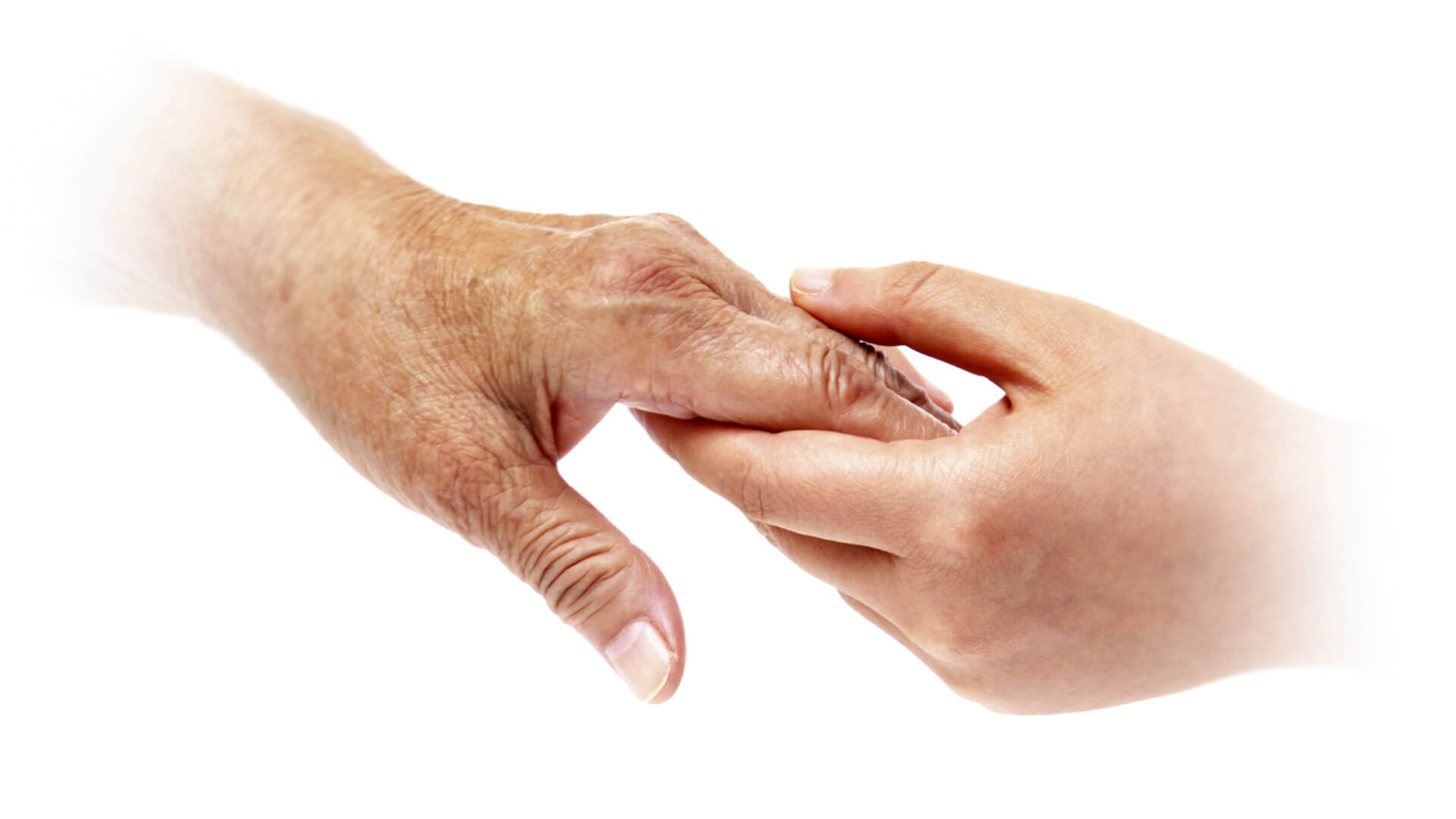
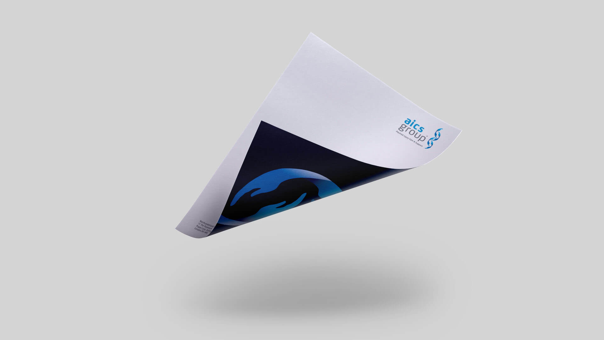
I was tasked to create a brand identity that reflected the various services that the AICS group provide. I combined the universal symbol of support and care using hands to strongly symbolise the double helix and care of the body, brain, spine and nervous system.
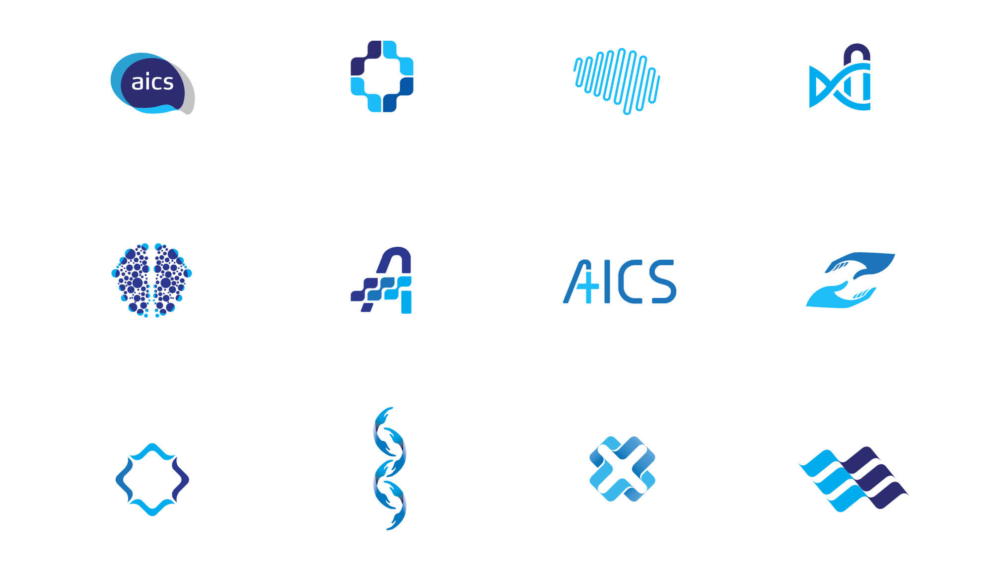
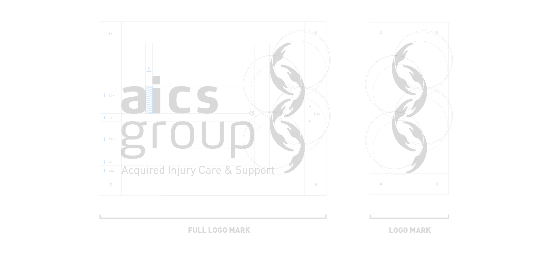
Aics Logo Details
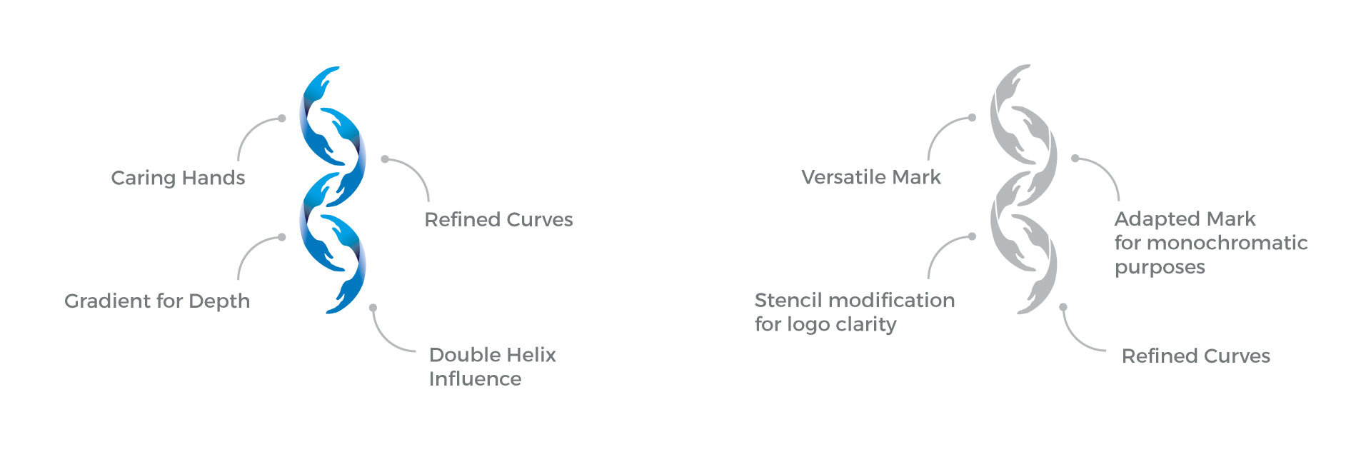
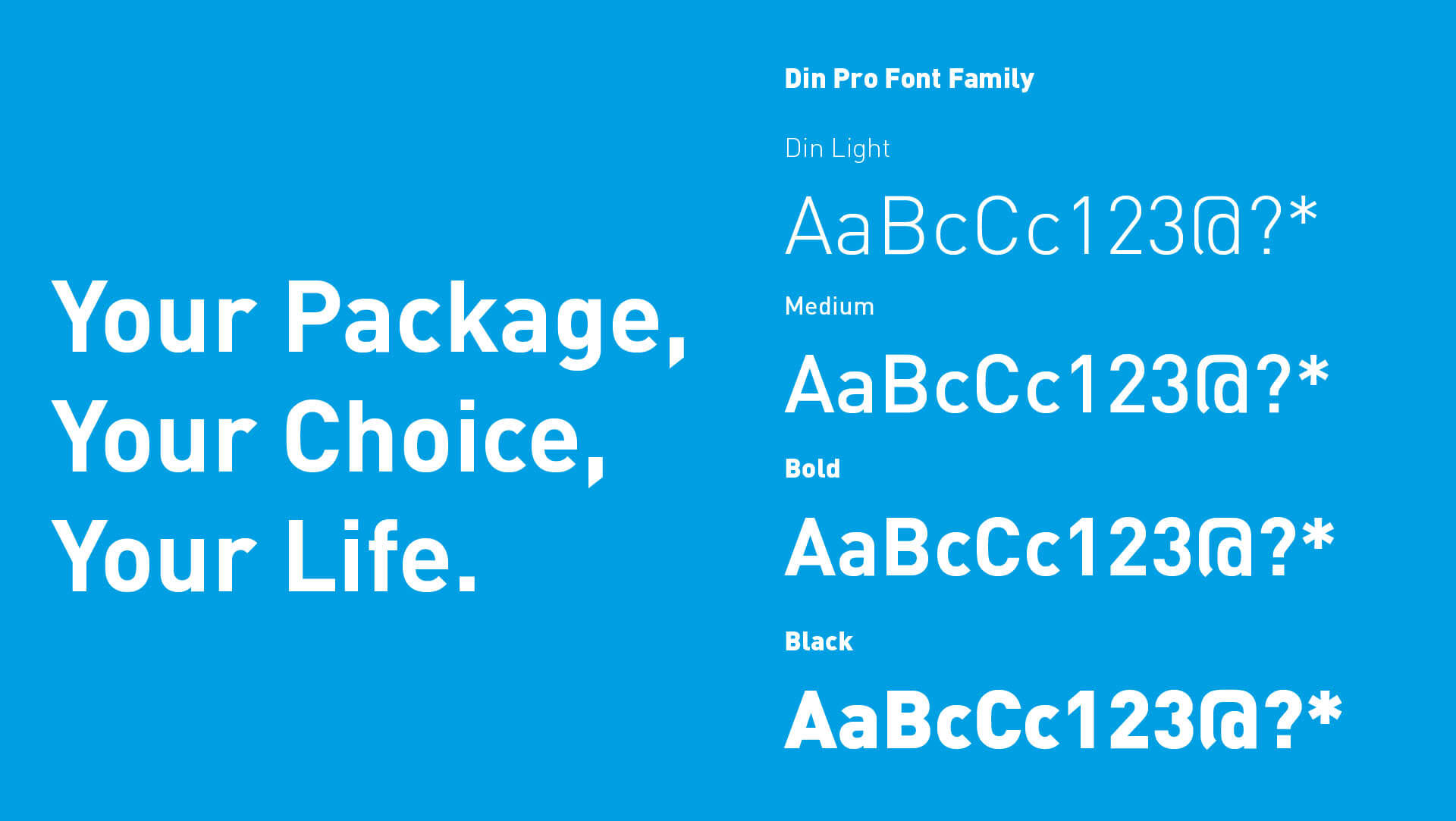
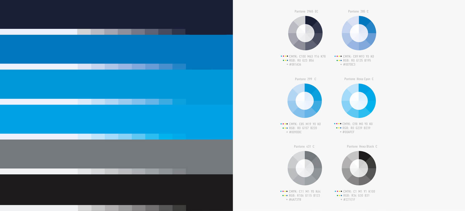
Each colour has it's own unique colour palette. The corporate typeface used is Din Pro and Max to accompany the logo mark.
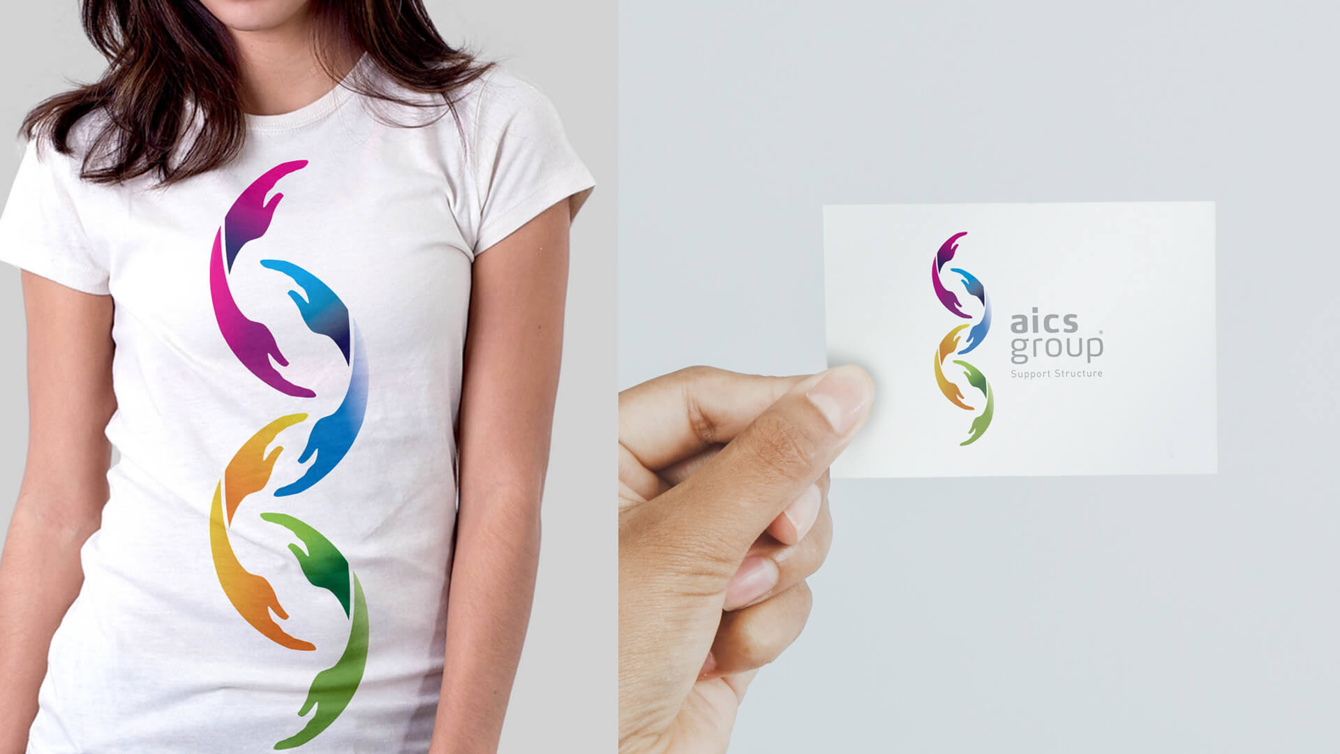
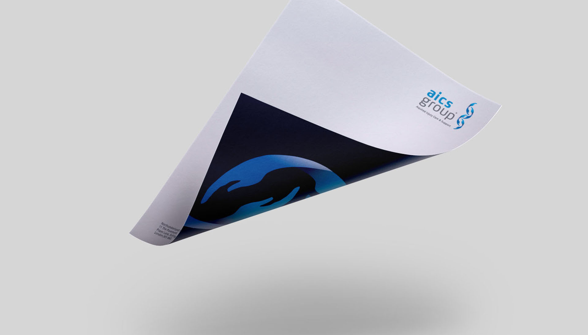
The goal was to make the brand versatile, approachable and fresh by ensuring that the brand has a modern look and feel. Once this was accomplished it was an easier task to apply the visual design throughout the brands stationary and other uses of the logo.
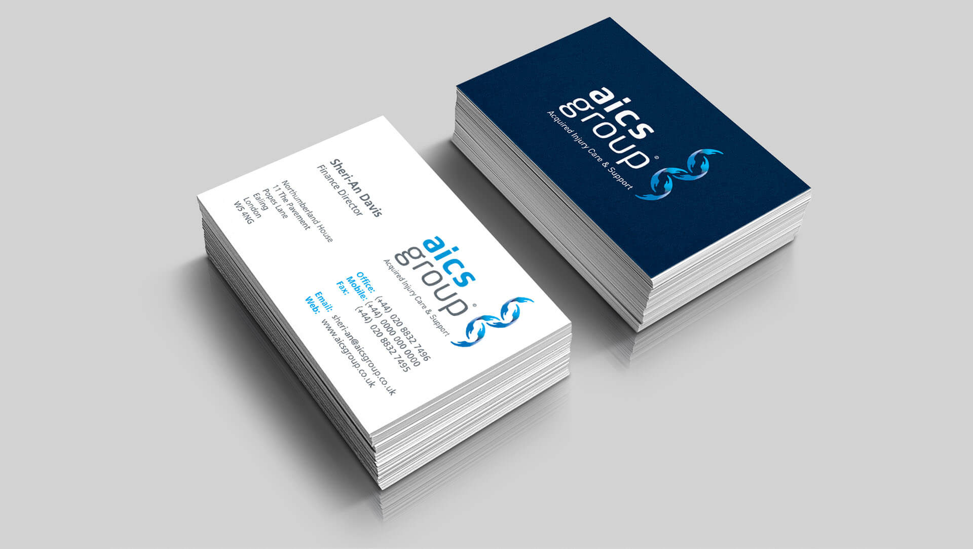
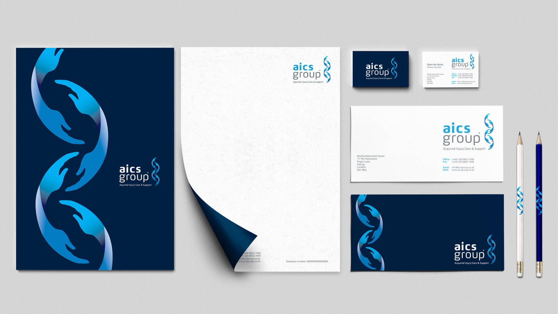

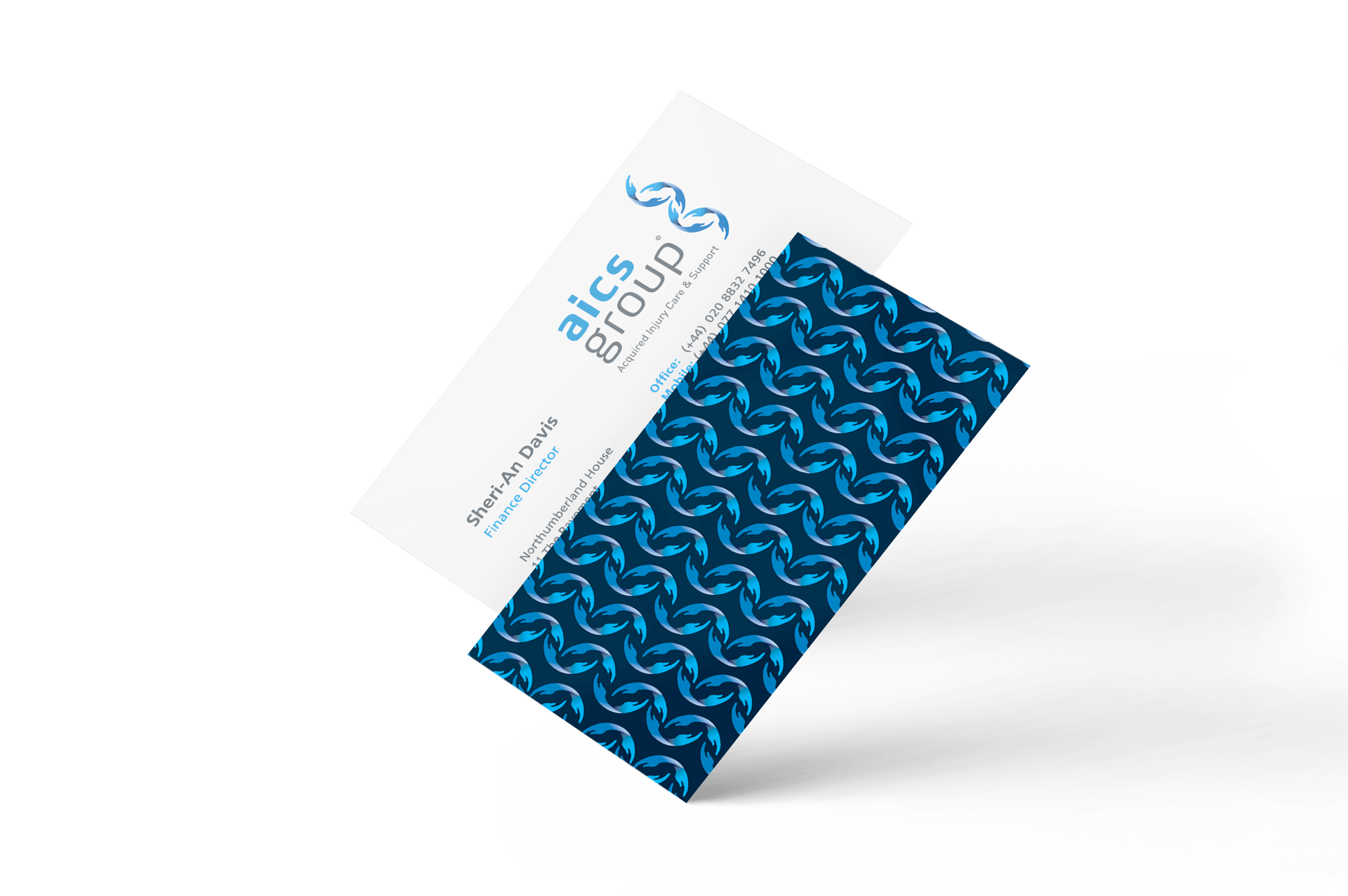
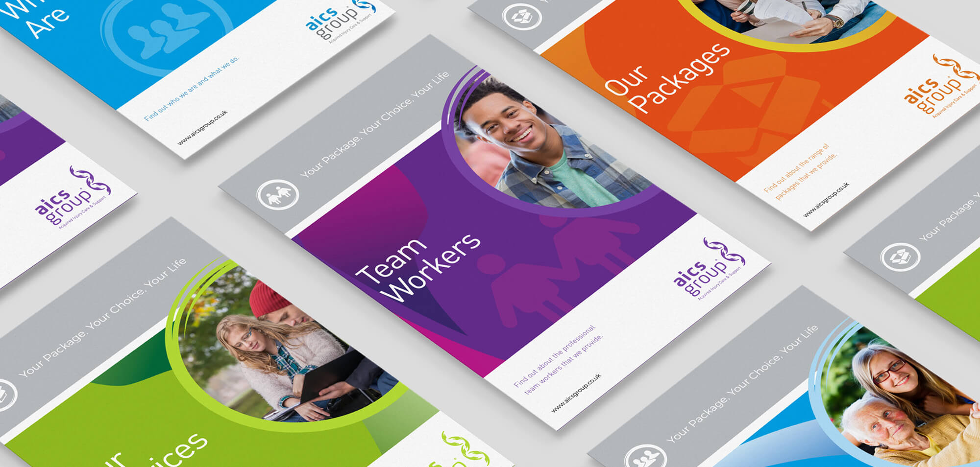
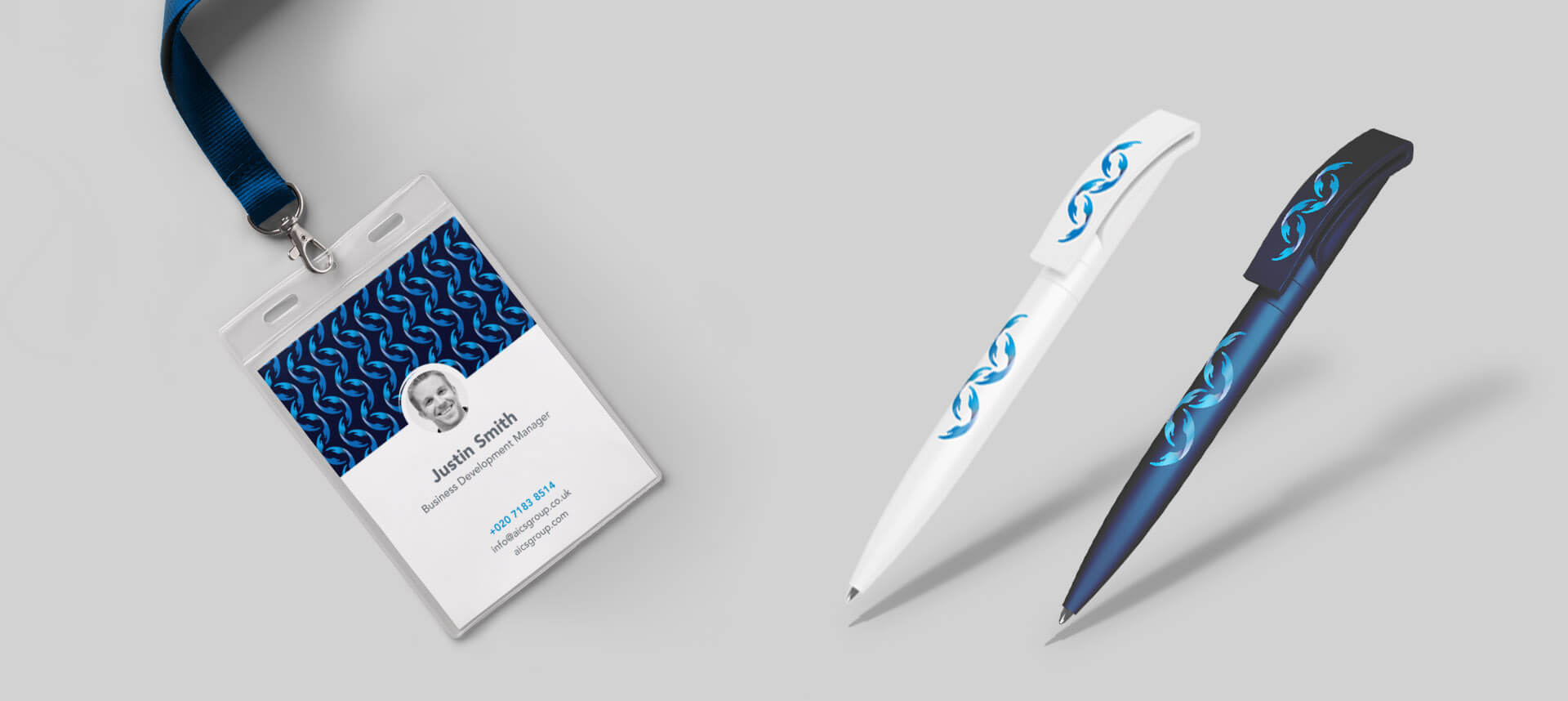
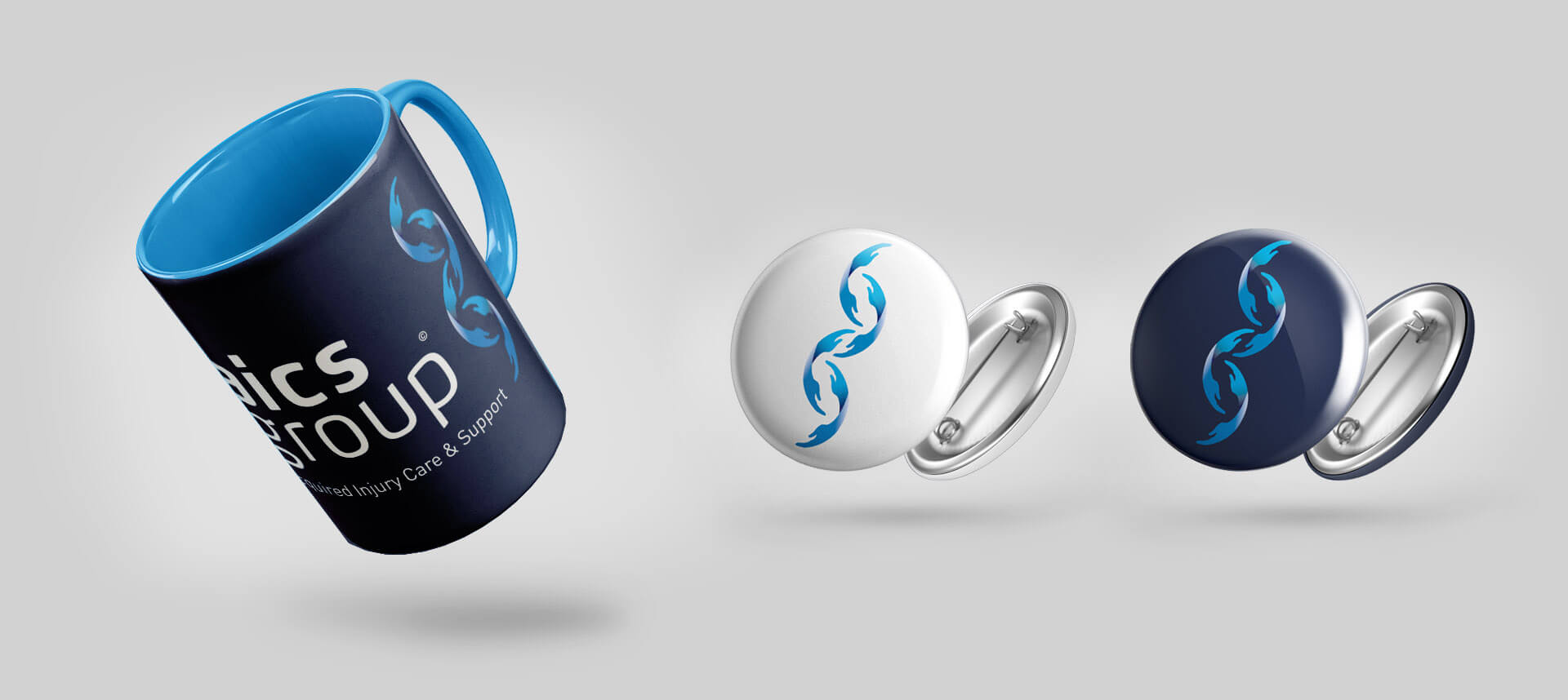
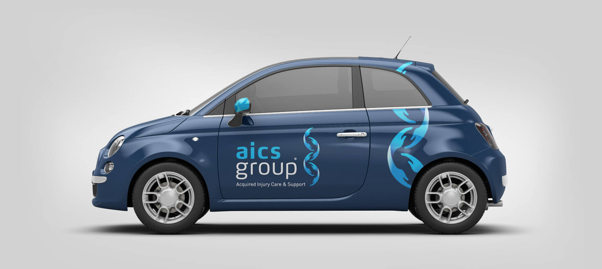
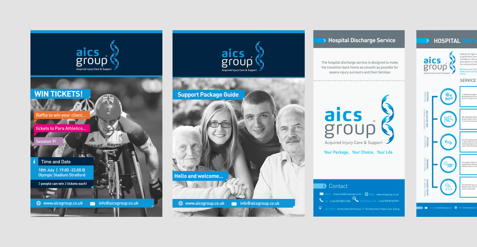
Here are some examples of applications based on this brand architecture
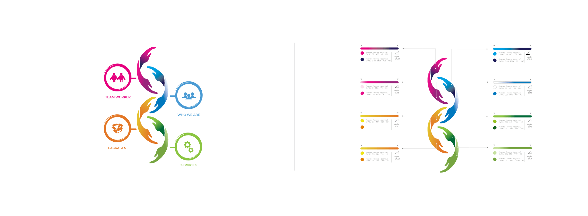
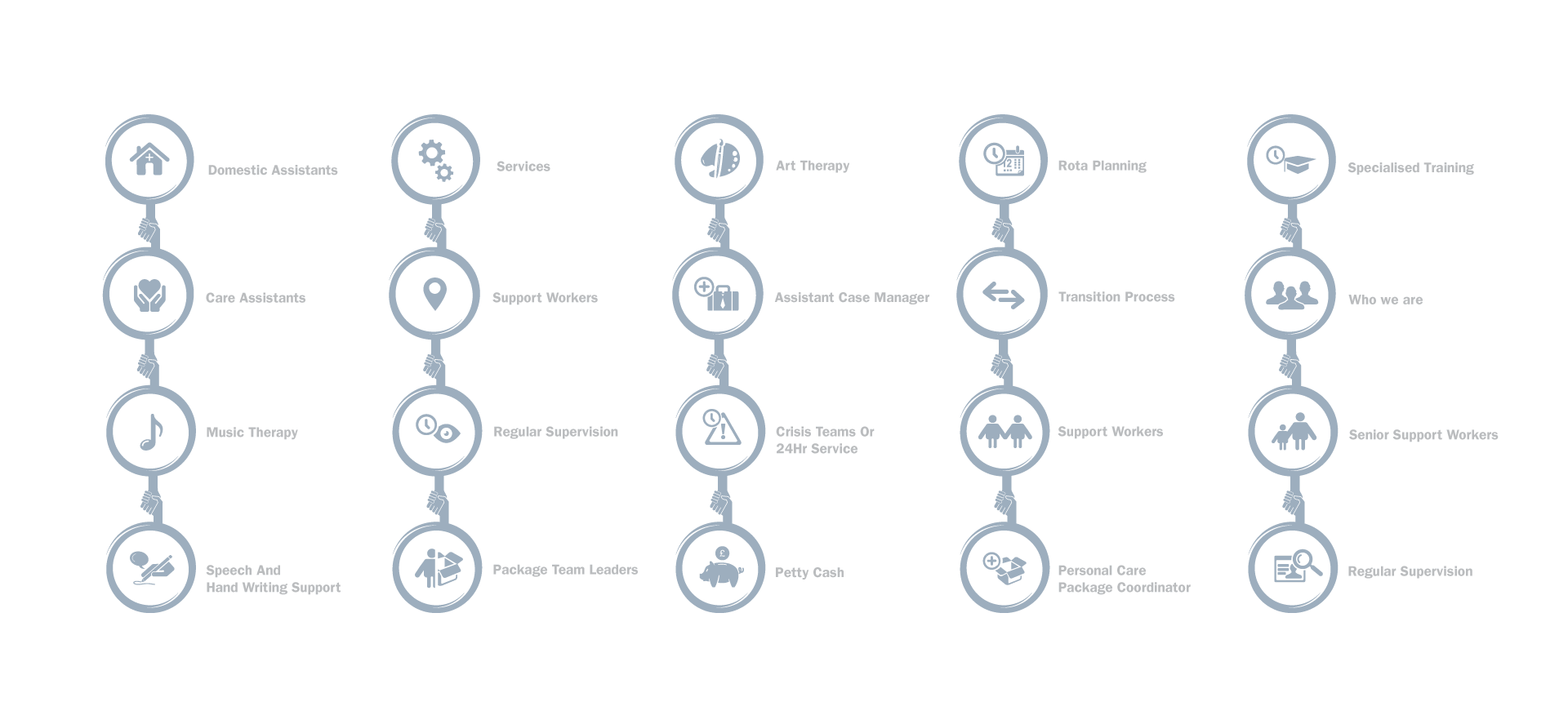
Brain Injury Case Managent Icons
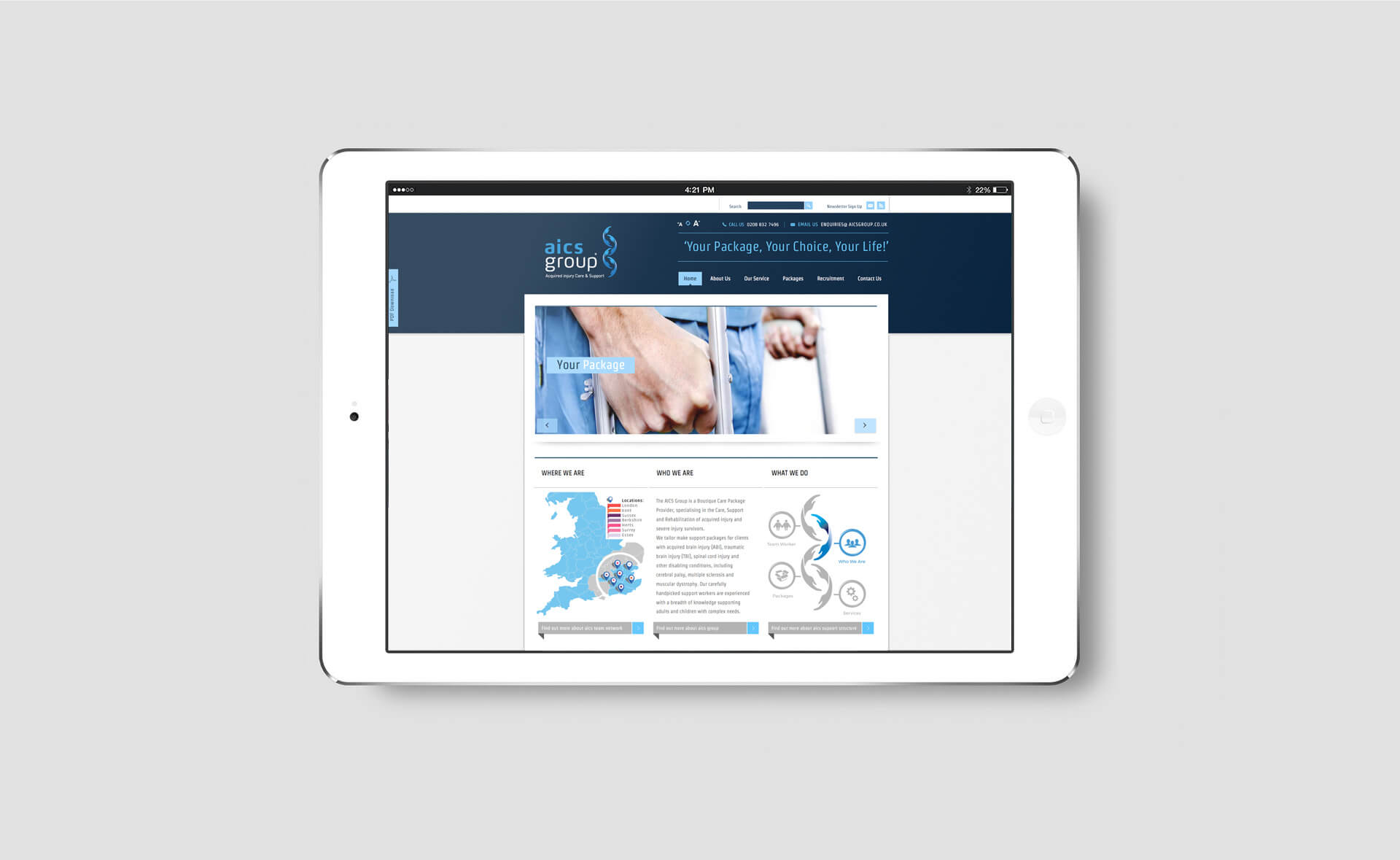
The AICS Support Structure was designed using the corporate identity to help define the companies core values but also allow the consumer to clearly navigate the site.